
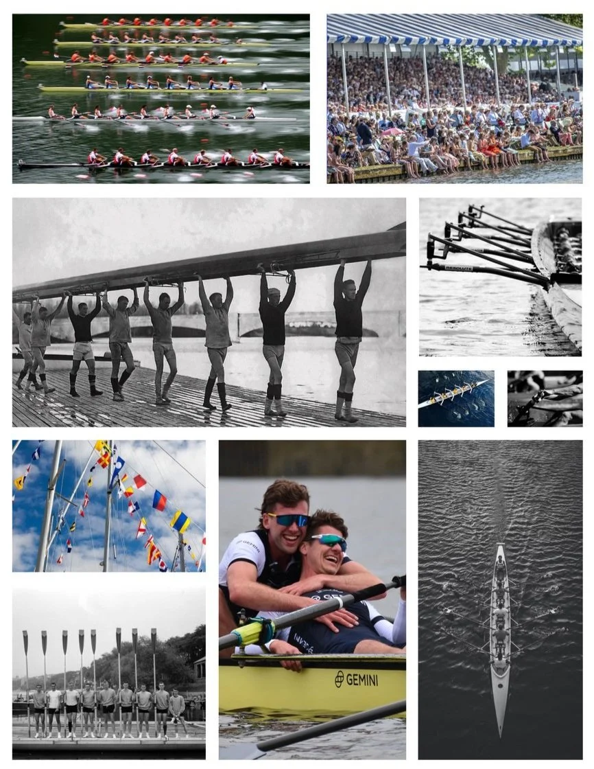
Head of the Charles Regatta is one of the largest and most renowned Regattas in the world.
THE PURPOSE
Known as “America’s Fall Rowing Festival”, more than 11,000 athletes come from all over the world to compete in a selection of 55 race events during a weekend in October. A redesigned visual identity was necessary to correctly communicate the importance and the values that this regatta and rowing have.

ROTATING LOGOS IN THE PAST FIVE YEARS
Two different identities that communicate different stories.
Imagery and text could be substituted for use at any other regatta.
The capital letters do not mirror the abbreviation HOCR.
Icons are not inviting - look as though they are guards or Poseidon.
Does not size down well even though it is used on merchandise.
Typefaces are different, even though they are from the same identity group.
The three core values of The Head of the Charles include camaraderie, competition, and promoting the sport.
This overlap could have been better aligned to specific corners or similar angles of the type.
CAMARADERIE
Teamwork is essential in rowing; everyone is relying on everyone - even if one is rowing by themselves. The team must support each other to succeed, and this is one of the reasons many people keep coming back.
COMPETITION
Created based on traditional races in England, HOCR consists of head races in which boats compete against others sequentially.
PROMOTING THE SPORT
Rowing is something that can be joined at any time. It is a sport that is not often talked about, and as HOCR is one of the largest regattas in the world it is important to promote rowing.
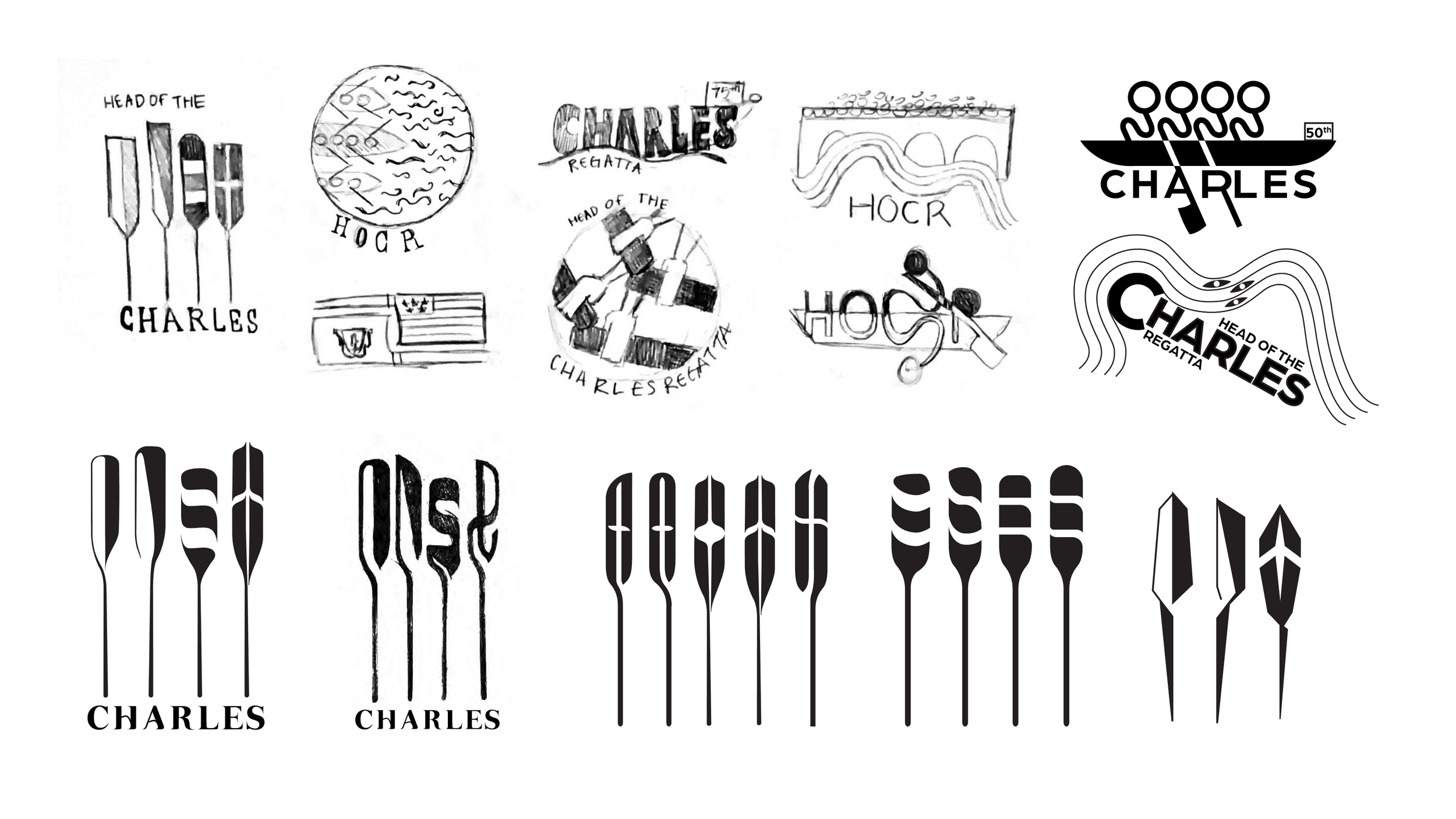

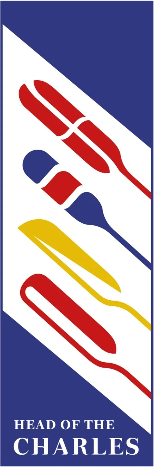
FINAL LOGO
The intention behind creating geometric and connected oar shapes that stand on their own was to give the appearance of both fluidity and strength, much like rowers taking one powerful stroke in the boat.
The contrast of the traditional style oars in contemporary forms communicates how the rich history of rowing is still relevant today. Adding in the serif “Charles” underneath aids in emphasizing this further while creating a welcoming close-knit culture.
The oar shapes are based on the nautical alphabet.
CONCEPT
The positive and negative space and specific colors used in the oars each mimic a letter from the nautical alphabet. This was done to reiterate the brand’s value of tradition and the rich history that comes with it. It also spells out HOCR, giving the logo a unique indicator.

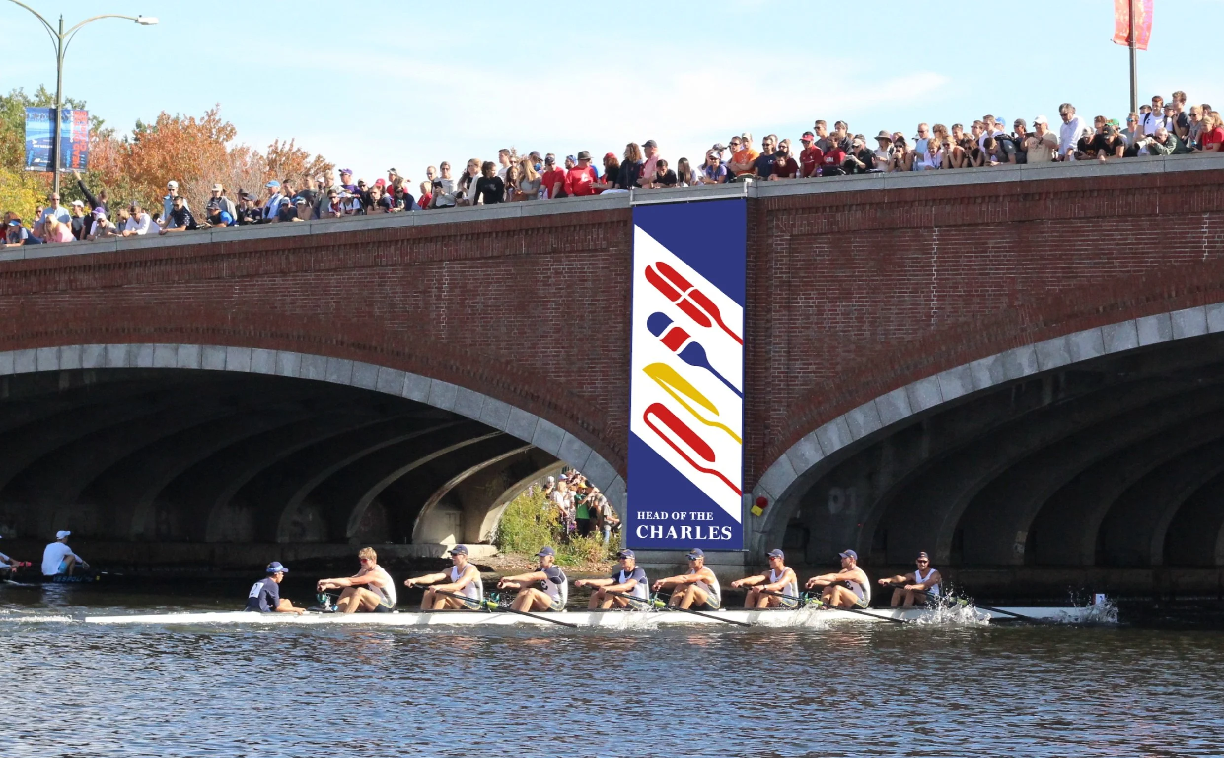
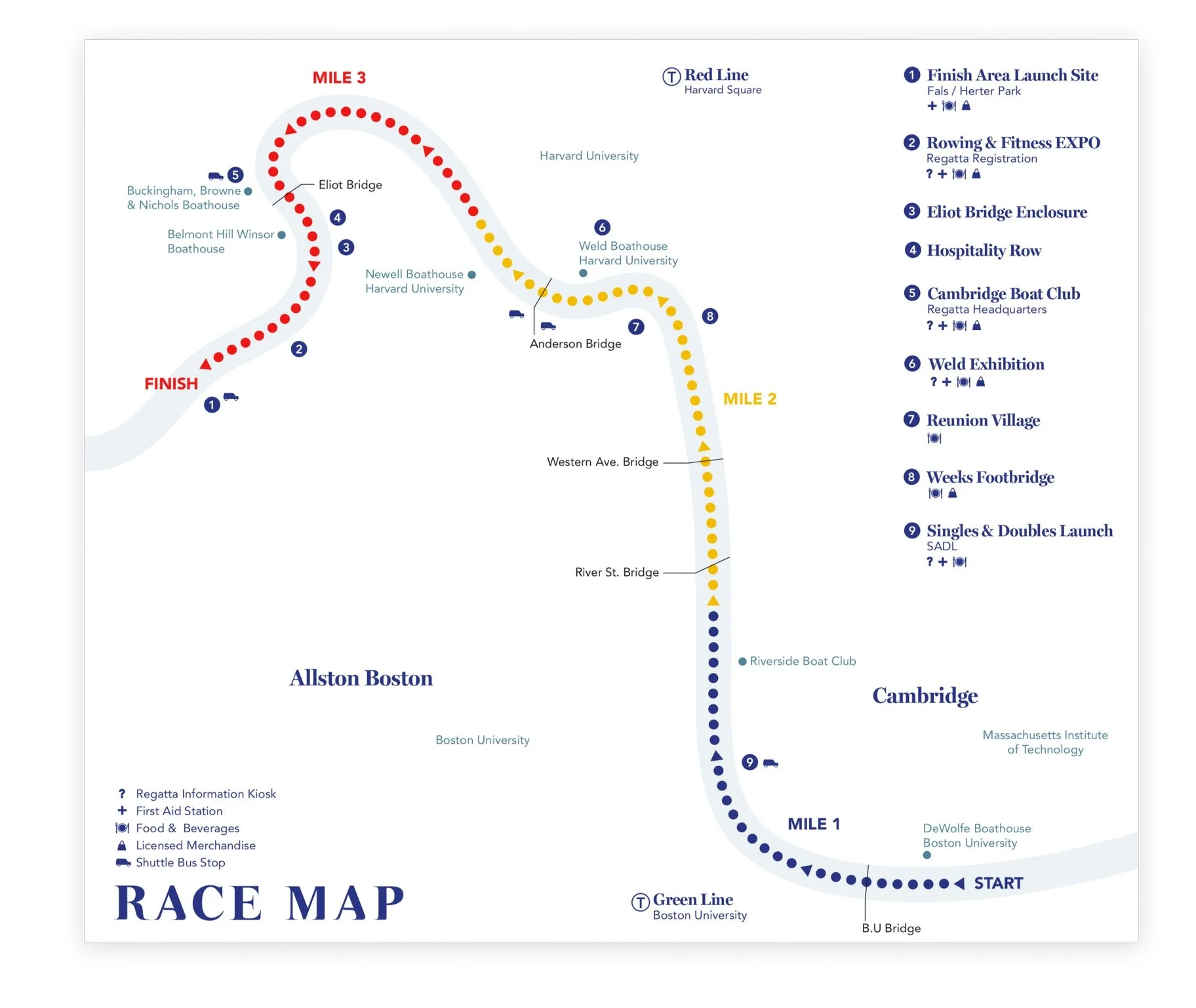
LARGE SIGNAGE
The Eliot Bridge, closest to the finish line, is the prime viewpoint for the race, capturing iconic photos. It serves as a popular spot for signage, acting as a guide for passersby and enhancing awareness of the event.
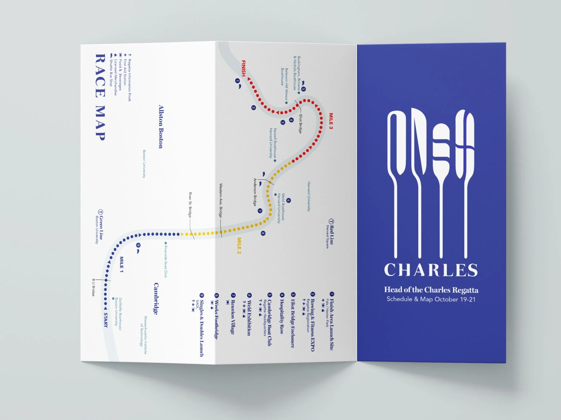
SCHEDULE
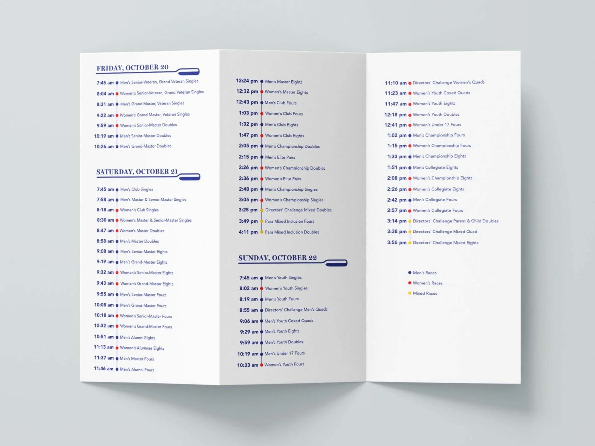
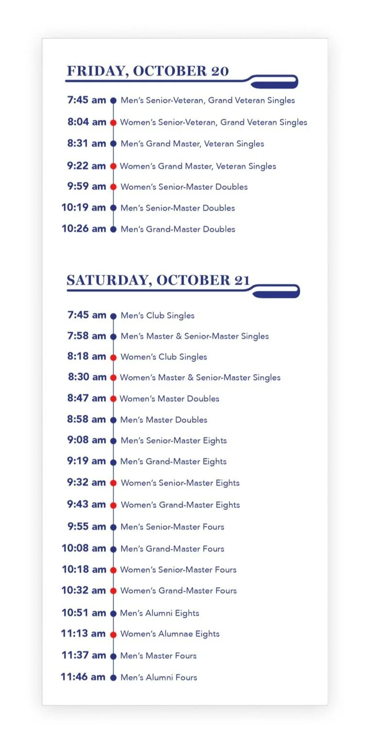
Efficient organization and timeliness are crucial for a large regatta. The touchpoint focuses on coordinating participants and informing spectators promptly, emphasizing flexibility.

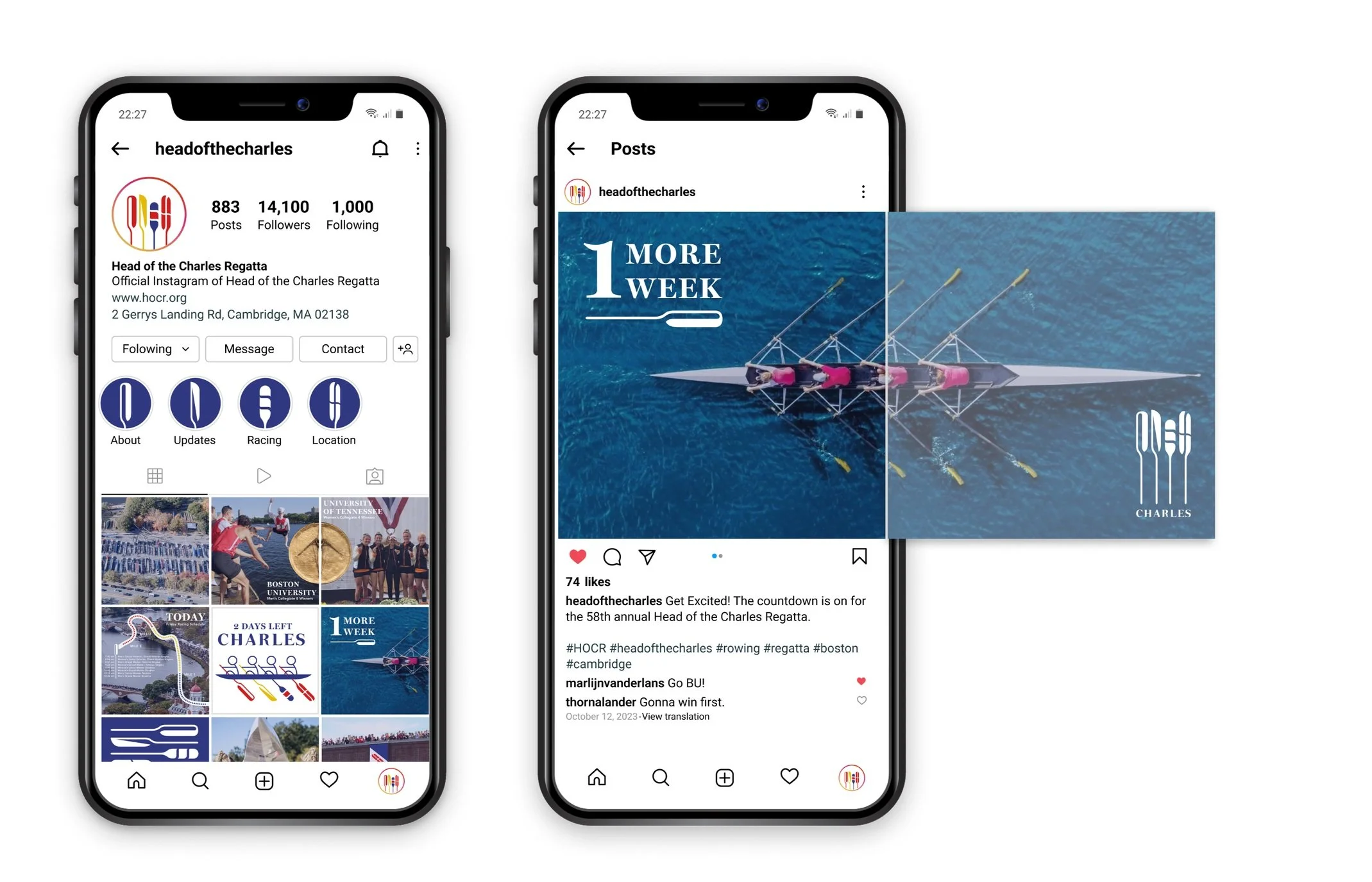
A strong social media presence is vital for the regatta's appeal to a younger audience. This touchpoint seeks to make the traditional sport exciting and offers an easily accessible platform for live updates, benefiting young rowers, coaches, and remote audiences.